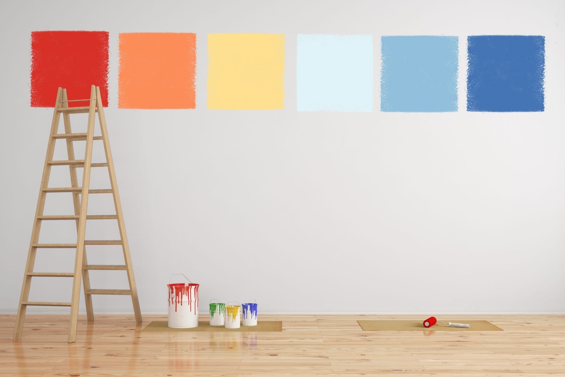
Choosing the correct color for your office space is very important because it can impact productivity and mood. Color can bring forward emotions, trick the brain, and make things taste better or worse.
Not everyone is affected by the same colors in the same ways. However, there are some colors that do tend to evoke a particular psychological reaction in the majority of people. It is these colors that businesses typically use in marketing and décor to increase customer engagement or employee productivity.
Research conducted by color expert Angela Wright has resulted in a number of demonstrable conclusions. While it is accepted that a person’s reaction to any color may be considered subjective, combining color harmony with what we already know from psychology usually produces predictable and accurate results.
In the animal kingdom, many potentially deadly species have evolved in a way that is described as “aposematism.” When predators see a brightly colored creature, they are less likely to consider it prey. In fact, it is true that most brightly colored insects or animals are able to deliver deadly venom or possess other active defense mechanisms.
One of the features that Wright describes to help explain her research is the presence of yellow stripes on black when referring to flying insects. “If it is black or navy blue, we will probably find it a minor irritation, but if it has yellow stripes our reaction will be different – most of us will recoil.”
There are so many areas where science can accurately predict our reactions to color. Our perspective of size, distance, mass, etc. is often dictated by color. As illustrated by the research, how we react to colors is also determined by color harmonies and schemes. So, how can you use color to boost productivity in your office? Well, that depends on what you are trying to produce.
Blue
If your business is focused on problem solving and logic, keeping employees attentive is important. Blue is a great color for employees in the IT industry as it enhances communication, reduces mental fatigue, and promotes calm.
Red
High-pace and physical intense workplaces may benefit from red. This is the color of physicality and strength, which may give employees that extra boost at the end of an already arduous day. Make sure that your team has time to wind down in a more relaxed environment, however.
Yellow
If you want to inspire creativity, think of mellow yellow. As one of the happiest colors on the wheel, yellow turns pessimists into optimists. When you need employees to feel motivated to produce works of art, decorating workspaces in yellow keeps everything light and breezy.
Green
Some industries demand overtime, which can result in serious eyestrain in an office environment. Green – the color of nature – is ideal for longer shift-work. You will also find that green works great for balance, especially where there is the likelihood that the events of each day may be unpredictable.
Purple
Be careful when choosing purple. It is an effective color for producing luxurious office spaces but can be overpowering if the wrong tone is used. Businesses that are focused on spirituality often use deep purple in products, marketing and visitor areas. If you are unsure of the types of customers you want to attract to your business, choose a neutral tone for balance.
Orange
Two of the most powerful colors (yellow and red) come together to make orange. Choosing orange may hinge on the nature of your business or the type of environment you wish to promote. For instance, orange is often used in working kitchens because it inspires both creativity and passion. Alternatively, an office that is geared towards high energy and fun may benefit from orange.
Grey
One of the most neutral colors in any space is grey. Using grey in productive areas can suggest a dull and lifeless environment, which isn’t exactly motivational. Conservative use of grey, however, can produce elegant work or customer-facing areas, provided there is sufficient ambient lighting or color balance.
Color and Children
Adults are somewhat desensitized to the psychological effects of color, provided that exposure is moderate. However, children react to color with undisciplined eyes. When thinking about color principles in business spaces used by children, expect an immediate and unfettered response to the sensory input. With that in mind, tone colors down or increase intensity as appropriate for best results.
If you would like to cast a professional eye over your office or business premises, the Arizona Painting Company can help. We understand the psychology of color in any space. Our team of professional painters can work quickly and efficiently, ensuring minimal disruption to productivity. Call today for an accurate and affordable quote. We provide commercial painting and residential painting throughout Arizona.

