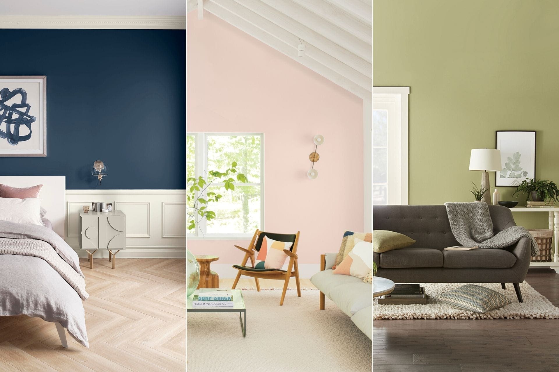
Many other paint companies now follow suit, debuting their own colors that they feel embodies where the world is going and the trends they expect to come with that. Pantone established the Color of the Year as a trendsetting concept for branding, marketing and creative society as a whole. The Pantone Color studies color trends throughout the year in order to decide on the next color of the year. They take into consideration all aspects of society such as fashion, marketing, world events, and even politics. To make it easier for you, we’ve brought together all the 2020 Colors of the Year to make your future painting decisions a whole lot easier.
Benjamin Moore’s First Light
Benjamin Moore’s choice is a soft and rosy pink called First Light. It’s touted as a fresh alternative to white or beige, a touch of color while still neutral enough to go with other colors. The company, like others, sees 2020 as a sort of dawn of a new time for the world as the beginning of a new decade. Andrea Magno, Benjamin Moore’s Director of Color Marketing, explained that “at the brink of 2020, we were just thinking, let’s be upbeat; let’s be happy.” The soft color was chosen because it’s a balance of color beyond just neutrals but it’s subtle enough to not overwhelm the eye.
So how can you implement this color into your home? While you may be opposed to painting an entire room light pink, First Light will make a beautiful accent wall to add a little color to a room and can be especially great for your kids’ room or nursery.
Sherwin-Williams’ Naval
The Color of the Year for Sherwin Williams is Naval, a rich navy blue that creates a calm and grounding feel. According to the company’s website, this color is a nod to Art Deco influences and was chosen for 2020 because of the sense of timelessness blended with new materials that bring us into a new decade. Naval is created with the awe-inspiring power of nature, from the infinite night sky to the endless depths of the sea, in mind.
Dark bold colors like these are the current trend to give your home a hint of sophistication and would look striking in an otherwise neutral kitchen, living room with bright furniture, or simply as an accent. If you’re feeling like fully embracing the colors of the year, pair Naval with First Light for a contrasting combination.
Behr’s Back to Nature
Behr’s selection is a soft and grassy shade of green called Back to Nature. The color was chosen for its association with nature, bringing light to growing concerns about sustainability and preserving the great outdoors. Interior designers have seen a big trend of bringing plants into the home for décor, along with health benefits, so the green shade works well to bridge the gap from the indoors to the outdoors.
Valspar’s 12 Colors
Valspar took a different approach in choosing 12 colors to bring us into the new decade rather than a singular shade. Each color is inspired by elements of nature, creating a collection of subtle hues that bring a sense of peace and tranquility into your home. The 12 shades are as follows:
- Winter Calm – A soft greige shade that pairs well with earthy neutrals and natural textiles such as leather and wood.
- Mint Whisper – A light and crisp mint color that works well with white to make small spaces feel light and airy.
- Canyon Earth – A peachy hue that embodies the rich feel of the desert and earth.
- Grey Brook – A pale blue-gray shade that works seamlessly with dark wood and other rich colors.
- Tempered Sage – Slightly muted lime green that will infuse fresh energy into a room.
- Desert Fortress – A light tan that will work with any combination of colors and textures.
- Secluded Garden – A jade jewel-toned color that embodies the feel of a quiet outdoor space.
- Bombay Pink – Inspired by the cheerful pinks in a spring sunset that is elevated when paired with gold accents.
- Pale Powder – A dusty apricot shade that warms up a room while still acting as a neutral.
- Utterly Blue – A powdery blue that pairs perfectly with whites and chromes.
- Crushed Out – An off-white with a tint of pink that can be used as a neutral and paired with bright colors such as blues, reds, and greens.
- Secret Moss – A gray-green color that works best with creams and other soft neutrals.
The Takeaways
Overall, these each company’s Colors of the Year are muted and softer than the colors of past years. They all focus on establishing a calmer and more soothing environment in your home and every color drew from nature for inspiration, indicating a trend towards a greater concern for our environment going into this new decade. If you’re looking to give your home a trendy new look, let Arizona Painting Company help out with our color consultants. Our painters are specially trained to help you choose the best shade for your home, ensuring that you will be left with a space that you can enjoy for years to come.

