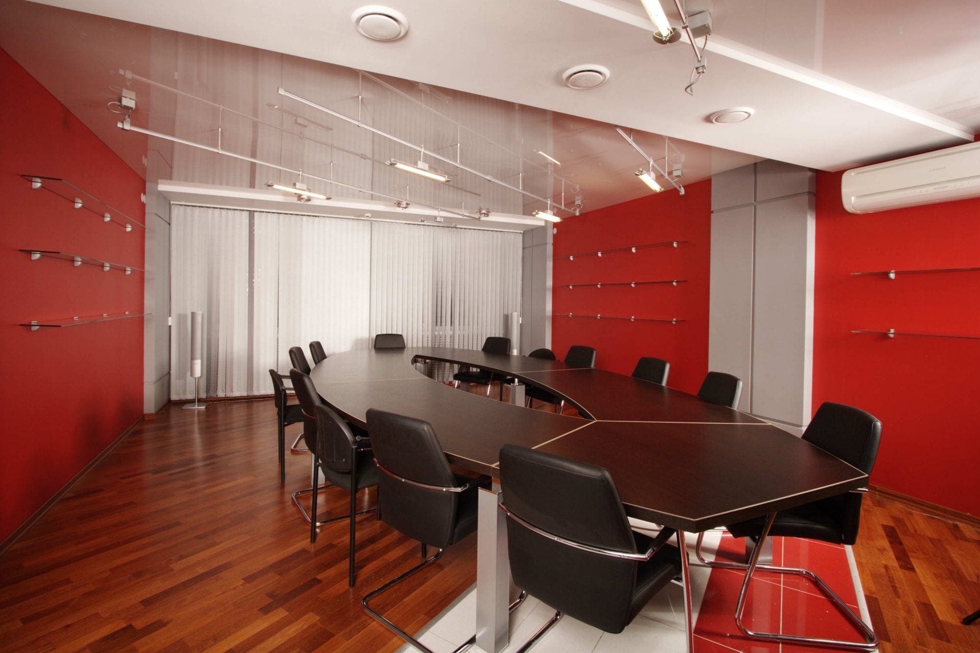
It is where you rally the troops for meetings, give client presentations, interview candidates—important business. So, you want it to set the appropriate tone.
So why is it that so many conference rooms tend to feel sterile, uninviting, even uncomfortable? Maybe it’s the paint color. Even if you have taken care to choose comfortable chairs, quality furniture, and inspiring décor, if your paint color doesn’t exude a welcoming tone, perhaps it is time to change it.
Giving your conference room an update with a fresh coat of paint may do more than just add to the aesthetic appeal. Turns out, the color you choose may affect the mood of the room. Something as simple as a coat of paint just may boost productivity, inspire creativity, and improve the morale of your team.
Psychology of Color at Work
Psychologists have done exhaustive studies on color and the influence it can have on people’s moods. While certain colors are said to trigger specific feelings in people, the context of the color has to be congruent with the application. So, a vibrant orange attorney’s office may send some mixed signals.
For some help in selecting the appropriate colors for your office conference room, consider the following colors and the effects they are said to have in a work environment:
Yellow
Vibrant, fun, and happy, yellow gives off energy and may stimulate metal sharpness. Brighter yellows may be best used in an office where creativity is essential to the daily tasks at hand. If your work isn’t necessarily all creative, but you wish to inject a dose of yellow’s happiness, a buttery yellow is a toned-down version that may still evoke feelings of joy.
A word of caution should be noted on using bright yellow: not only can it be off-putting, but it can also lead to feelings of frustration.
Orange
Like yellow, orange is an energetic and lively color that is associated with warmth and sunlight. It can also have a way of looking very modern. Orange can be an effective color to create enthusiasm in your team and may help stimulate creative ideas. Know that it can also stimulate their appetites, so orange may be best used as an accent color in meeting rooms where staff spend a considerable amount of time.
Red
A bold choice for an office conference room, red comes with some risk. Discussions in red conference rooms may result in fruitful and stimulating debate or contentious arguments. Using red as an accent color, diffused with a more neutral tone, should offset any negative effects and allow the power of the hue to remain a positive force.
Blue
Blues are very popular tones in workspaces because they tend to exude peacefulness and relaxation. Blue has also been shown to help reduce anxiety and even lower blood pressure and heart rates. It is also thought that blue evokes feelings of trustworthiness, confidence, and loyalty, which is probably another reason why it is so popular in work environments—who wouldn’t want their team to feel this way?
As a rule, blue is a good option to choose, whether your office conference room is used for staff or clients, as it creates a comfortable and welcoming environment.
Careful when using darker tones of blue, as they can tend to feel a bit depressing.
Green
Greens give a nod to nature and freshness. Another strong contender in the most popular paint colors, green offers vitality, liveliness, and may even be a natural energy booster for your team. Green is also easy on the eyes, providing respite from computer screens.
When using green, you can actually choose your mood, depending on which tone you use. Darker greens tend to enhance concentration, while brighter greens boost energy. For the best of both worlds, a tone that falls somewhere in the middle is likely a good option for your conference room.
Purple
Purple represents luxury, creativity, and ambition. And although it may seem like an unlikely color choice in the office, if yours is an ultra-creative environment where artistic minds meet to come up with extraordinary solutions, purple may provide the appropriate vibe for your space.
Pink
A very feminine choice, pink can have a very relaxing effect on employees. Too relaxing, in fact, to the point where there are few work environments—if any— where pink is an appropriate color choice.
Neutrals
Brown, black, white, and gray are all neutral tones that are likely to be found somewhere throughout the office environment, and for good reason: they go with everything. Using too much of the darker tones can take down the energy, while a double dose of lighter tones may feel stark and uninspiring. These neutral tones may be best used to help bring out certain colors, tone down others, and make the whole space feel cohesive.
Giving your office conference space a new coat of paint can do so much more than freshening up space, it can help inspire and motivate your team, encourage creativity, and spark lively debate—all depending on the color you choose.
If it is time to freshen up your office space, contact the team at Arizona Painting Company for a free consultation.

